Research Questions, Academic Writing, and Presenting
2022
Ha Bich Dong, Carlie Kane, Corey Petsnik, Dr. Shayna Plaut

This resource guide is for students to help them get started on a writing project with tips on how to generate your research question and present your work for different audiences.
Research Questions, Academic Writing, and Presenting
Start with the audience. Who IS your audience?
- Do they have previous knowledge of the issue?
- Are they coming from an academic background?
- Demographic questions – ages, linguistic backgrounds
Thinking about your audience will help shape both the content and the style of your presentation. It will impact the language you use including the amount of slang/jargon used in your presentation as well as the length and formality/informality of the presentation.
Don’t assume that the presentation needs to be formal – it depends on the goals of the presentation, as well as the audience. Don’t be afraid to adapt your language/medium depending on the goals and audience of the presentation.
Think about the different ways you can share your information and your research. There are multiple formats such as:
- Podcasts
- Infographics
- Roundtables
- Powerpoint/Prezi
- Video
When planning your presentation, think about how much information you want people to walk away with. A useful exercise is to consider what are the three most important things the audience should know after listening to your presentation.
Often LESS text is worth more! Any text that you have on a presentation should be complimented by visuals that will trigger thought and the ability to remember the information presented.
Remember to define your terms in the way that you are using them because, if you fail to do that, the audience will use their definition which may, or may not, be the same.
When first beginning to start research, ask yourself:
- How to plan / outline this research report?
- Who is the audience?
- What do I want to convey to the audience reading the research? Or what three things do I want to make sure they walk away knowing.
The beautiful thing about research is that it often doesn’t stick to the same path you initially had in mind rather it changes as the research changes. This is NOT a bad thing – it shows growth through the research process. In other words, the goal of your research will most likely remain steady but the research process, and findings, and analysis will be dynamic
Some things that would be a hiccup or challenge would be:
- to make sure the research is thorough but succinct. It should answer the question or address the research goal but also be digestible to the audience
- Linking research with previous research (the research itself tells a story; tell a story with the research) but also recognize you are not going to know everything
- Stimulating questions that engage the audience and the researcher
- Why is your research important?
- How would you expand your research?
- How could the findings be used?
- What would you improve?
- “Am I on the right track?” When writing bigger research reports, there is often a lull period and it can be a bit discouraging. Don’t worry! This is part of the process. Having another person (or 2 or 3) to help read your work and ask the questions you may not even be able to see is important. It can also help you with motivation
- Setting deadlines; deadlines can enable motivation, goal setting and accountability. Speaking of accountability, if you are in a writing group or working collaboratively with others this form of external accountability can be helpful.
- Be familiar with the platform that will be used (e.g., Teams, Zoom, Google Meet, BlueJeans, etc.)
- Double-check audio, speaker, and camera prior to the presentation
- If need to share screen, make sure the host has enabled that function
- Avoid places with lots of background noise (e.g., construction)
- Make sure to have a stable internet
- Use virtual background or blur background if needed
- If possible, enable closed caption to increase accessibility
For other types of presentations that include visuals:
- Be mindful of accessibility
- This could mean making sure the font size is large enough (for printed materials, typically no font size smaller than 9 points);
- Or to use images and colours with high contrast. Colour combos like red and blue or red and green have similar contrast and thus can be very difficult for people with colour vision deficiency;
- If information is not organized clearly or presented with no focal points, it could be difficult for some neurodiverse people. For example, use a title, heading, sub-heading, etc. if needed. Also, avoid using multiple typefaces (fonts) together (the rule of thumb is no more than 3) and avoid using typefaces that are hard to read.
Limit use of text, especially bulleted lists. What you have included on the slide and what you are saying out loud will compete for audience members’ attention and they will have difficulties focusing on both, particularly if there is a lot of text.
If it is necessary to use bullet points present items individually and allow audience members adequate time to digest each point before moving on. Make sure the text is an appropriate size (e.g., 24 point or larger) and presented in a font type and colour that is easier for all audience members to see (e.g., sans serif fonts, such as Arial, Calibri, Tahoma are particularly good). Also avoid clutter and overwhelming the audience by ensuring that each item is concise (e.g., not more than 2 lines per bulleted item).
Instead of lots of text and bulleted lists utilize images, graphics, video clips, figures, tables, diagrams, or some other sort of visual to capture the main idea for each slide. If possible, select a visual that is relevant and familiar to the audience. This will help the audience connect your work to their own experiences and prior knowledge and enhance the likelihood that they engage with and remember it. Also focus their attention on the most important elements either verbally or through the use of colours, shading, or animation and break down complicated images (e.g., graphs, tables, statistical or theoretical models) piece-by-piece.
Much like PowerPoint slides, it is best to try to limit the amount of text on a poster. Posters should be clear and concise and highlight only the most essential information about your research. You can elaborate on other details as you “walk people through” the poster and answer questions or you could include them in a separate handout. The 20-40-40 rule is a good guide for how to structure a poster: 20% text, 40% graphics, 40% empty space.
The poster should be organized in an easy to follow and logical layout with information arranged in different sections (e.g., Introduction, Results, etc.) offset and accentuated by empty space.
One way to organize a poster is referred to as “pure column” wherein the information is presented in columns starting from the top left through to the bottom right and the reader/audience works down and up the columns from left to right (see image below).
An alternative way to organize a poster is referred to as “pure row” wherein information is again presented starting from the top left through to the bottom right, but is organized in rows rather than columns and the reader/audience works across the rows from left to right (see image below).
Pure Column Layout
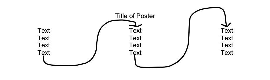
Pure Row Layout

Text size should be large to ensure that your poster is easy to read from a distance. See guides for size of text of different elements below:
- Title: 96 point
- Author names: 72 point
- Affiliations: 36-40 point
- Section headings (e.g., Introduction, Methods): 36 point
- Supporting text: 24 point
- Conclusion: 36 point
- Methods/references (if applicable): 18 point
Employ sans serif fonts (e.g., Arial) that are simple and easy to read.
Boldface, capitalization, underlining, or colour can be used judiciously to emphasize certain key pieces of information.
Figures and tables should only highlight the most essential information. Font should be large, lines and labels should be big/thick and colour coded. A summary can be helpful to highlight the “take home message” from the figure or table.
Figures, tables, and any other included visual elements should be relevant to the work highlighted by the poster and be clear and of a high resolution/quality.

Contact Us
We’d love to hear from you.
442 Robson Hall
University of Manitoba
Winnipeg, Manitoba
R3T 2N2 Canada
204-474-6453
Quick Links
Subscribe to our mailing list for periodic updates from the Centre for Human Rights Research, including human rights events listings and employment opportunities (Manitoba based and virtual).
Traditional Territories Acknowledgement
The University of Manitoba campuses are located on the original lands of the Anishinaabeg, Ininiwak, Anisininewuk, Dakota Oyate, Dene and Inuit, and on the National Homeland of the Red River Métis.